#for clarification i mean this specifically about the designs of characters not the art style. which is always beautiful
Explore tagged Tumblr posts
Visit Tumblr Blog
Explore Tumblr blogs with no restrictions, modern design and the best experience.
Last Seen Tumblr Blogs


Fun Fact
130K people were victims of a chain letter scam that affected Tumblr in May 2011.
Text
me when i like the official art: all of these people are drawing this character completely wrong and bad. i mean the official art is right there like why dont you just percieve it and then draw exactly like it says forever
me when i dont like the official art: wow... people really think that you have to draw characters exactly like the official art always. SAD
#for clarification i mean this specifically about the designs of characters not the art style. which is always beautiful#said as a lover of the very first m9 art and a hater of the eiselcross and c3 art#art#fandom#fanart#critical role#pjo#elias chitters
11 notes
·
View notes
Text
Debunking Edens Zero Misconceptions
With the recent announcement of the Edens Zero anime I keep seeing the same questions, confusions, and common misconceptions on absolutely every platform I go on. I thought it’d be helpful to compile them all in one place and try to clear up some things people genuinely seem to be confused about. With Edens Zero being the third work from Mashima, it’s subject to some... opinionated responses. I wanted to create a list of actual facts and information because it’s important for others to be able to learn about it without the individual biases of internet haters / supporters being involved.
If there are any questions you yourself have, or others that you’ve seen commonly asked or given incorrect responses to, feel free to leave a reply and I’ll try to update the list when I get the chance. Also, feel free to share this with anyone you know who might be confused or need clarification, the more factual information we can spread the better.
Lastly, I’ll be staying as spoiler free with this as possible, so if you’ve never seen Edens Zero, or are contemplating watching it, this won’t spoil anything plot wise whatsoever. If anything, I think it would be helpful to read this before getting into the series so you’ll be somewhat prepared for what you’ll see, but that’s up to you.
This is gonna be a monster of a post, so check it out under the cut below!
[Updated: Jan 20, 2021]
Just a tiny disclaimer: I’m not going to be answering questions such as “is this as good as Fairy Tail?” or “is the story writing better than Fairy Tail’s?” because that is extremely subjective. I can make a post similar to this one about my feelings about the series in response to questions like that if anyone is interested, but at least here, I’m aiming to be as factual as possible.
Why does this look like Fairy Tail?
I’ll be honest, it was hard to choose a first question to start this out with. But I believe that this is the best possible place to start.
The reason that Edens Zero looks similar to Fairy Tail (in terms of art style) is because the authors of both series’ are the same guy: Hiro Mashima. Just by looking at Edens Zero, there are notable similarities stylistically and character design wise in relation to some of his older works. So that’s where that familiar feeling is coming from when you look at Edens Zero.
Why are some of the characters in Edens Zero the same as characters in Fairy Tail?
Short answer: They’re not.
Long answer: There are characters in Edens Zero that are specifically designed to resemble characters from Fairy Tail. It’s not coincidence, or even a lack of creativity. Mashima would like people to be able to make connections and draw similarities between the characters of all his works. That being said, he makes sure to include differences between them so that his audience knows they are not the same characters.
If you’re concerned about the personalities of the characters in Edens Zero closely relating to those of Fairy Tail characters, then the series has already given us little to no need to worry. Where a character may fall short of a completely unique design, they often make up for it with their distinct personality and their backstory. A character that has a striking resemblance to one you already know might be an entirely different person in Edens Zero.
So when you look at the protagonists of the series, and they remind you of some familiar faces, those familiar faces are exactly who Mashima wants you to think about. But that isn’t to say they are mere “clones” of the people who came before them. And that goes for more than just the protagonists actually, but they’re the most notable similarities early on.
Is the Happy in Edens Zero the same Happy as the one in Fairy Tail?
No, the Happy in Edens Zero is NOT the same Happy as the one in Fairy Tail. Yes they have the same name and similar designs, but they are different people (cats?) with different backstories and different companions.
Why is Happy even in Edens Zero?
He’s the companion character. Mashima dabbled with making him a different species, but ended up settling on a classic fan favorite design. He sees Happy sort of like his mascot, since he has now represented both Fairy Tail and Edens Zero.
If you look closely, there are other non human characters who pop up from Fairy Tail, as well as Mashima’s eldest animated series, Rave Master.
Does Edens Zero happen in the same universe as Fairy Tail? Alternate universe? (Fairy Tail in space? Fairy Tail in the future?)
The Fairy Tail and Edens Zero universes are completely separate. Edens Zero is not a Fairy Tail time skip, nor are any of the characters in any way related to Fairy Tail characters. (If me hinting at it wasn’t enough: Eden’s Zero is not Fairy Tail Next Generation)
Alas, that would mean that the male protagonist is not the secret love child of Natsu and Gray, but you’re free to write as much fanfiction about that as you like!
Is Edens Zero a continuation/spin-off/reboot/sequel to Fairy Tail?
Edens Zero is a fully original work, unrelated to the story of Fairy Tail. (Does it feel like the millionth time I’ve said that, because it should). So no, it’s not a continuation. Edens Zero also doesn’t qualify to be a spin off because it’s not a subset of Fairy Tail; it isn’t the Fairy Tail story or world twisted / changed in any way because Edens Zero is a standalone piece.
It also stands to reason that based on everything I’ve already said, it isn’t a Fairy Tail reboot either. Edens Zero will take you on a completely different story, because the two series’ aren’t linked. And finally, no, Edens Zero is not a sequel to Fairy Tail because guess what? Fairy Tail actually has a canon sequel! It’s a biweekly manga series that goes by the name ‘Fairy Tail 100 Years Quest’. So logically, Edens Zero can’t be a Fairy Tail sequel when one already exists.
(Also, per the dictionary definition of the word “ripoff” – an act or instance of stealing off of another – Edens Zero doesn’t qualify. You can’t really steal something you already own.)
End Note:
Edens Zero is the third work from Hiro Mashima getting an anime, and it’s understandable that there’s a lot of confusion around it. Especially after the PV dropped and it was clear that the art style was very similar. And not to mention everyone losing their minds when they saw Happy in this strange new world. All of a sudden it raises these questions and there isn’t really a definitive place to get answers.
At this point I’m sure I sound like a broken record. But I’ll repeat these things as many times as needed to clear up the misconceptions and misinformation being spread around. As new people get introduced to Edens Zero, they will likely be asking these same questions for years to come. So I found it useful to just try and catch the problem now while it’s still new.
If the day ever does come where Mashima tells us it was all a hoax, everything was a lie, and he was playing us like an instrument the entire time... then I’ll be sure to update this.
Again, there are probably plenty of questions that I never touched on so feel free to comment anything else you or others need clarification on! I was doing some research for this and wow, Google really isn’t spoiler free, is it? Which is obvious, because it’s just a machine, but I hate that even if someone wants more information on something, looking it up is out of the question because that would give them spoilers about some pretty crucial plot details. That makes me feel awful, as a person who absolutely hates spoilers. So I want this to be a compact, spoiler free, factually based post about a lot of the common questions in the Edens Zero fandom.
Thanks for reading!!
#edens zero#anime#manga#edens zero manga#edens zero anime#ez#ez anime#ez manga#fairy tail#ft#fairy tail 100 years quest#ft100yq#ft 100yq#hiro mashima#rave master#debunking#debunked#edens zero questions#edens zero misconceptions#edens zero fandom#edens zero happy#fairy tail happy#fairy tail natsu#natsu dragneel#fairy tail gray#gray fullbuster#highkeyweeb talks
27 notes
·
View notes
Text
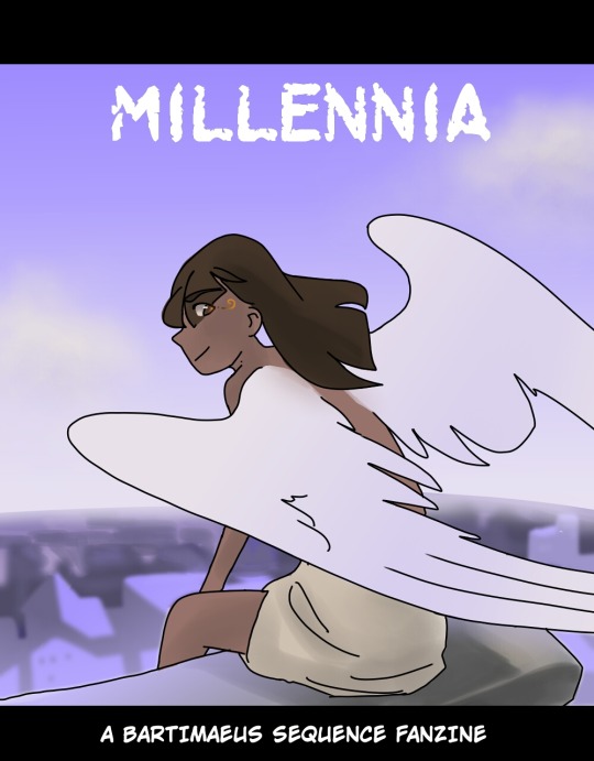
Announcement
Greetings humans,
This is the official announcement for Millennia, the Bartimaeus Sequence Fanzine! In this announcement, you will find instructions on how to sign up and learn more about the zine details!
Deadlines:
Applicant Deadline: Application period until September 10. (If we get messages for late applications, we can open till September 30th at the latest.)
Submission Deadline:
Creative period! (Now to November 30th)
Check in- November 1st. (Tell us your progress/completion status!)
Deadline- November 30th.
Zine publication date: Zine organizers will format and put out the finished PDF by December 20th if possible. (Dec 31 at the latest.)
Zine Information:
The zine will be titled Millennia, with the theme of time continually passing...
It will be separated into sections for each individual book in the sequence
To expand on the theme, the majority of the zine will be filled with memorable scenes from the books in chronological order.
These scenes can be depicted with imagery, writing, or a mix. Ideally each scene will include a memorable quote either in the piece (fake screenshot) or on the side in extra white space (Sign up for scenes in the “ideas sign-up” google excel sheets)
However, we want the zine to read like a film concept art book, in honor of the new upcoming (hopefully?) movie.
So it will also scatter in images of:
Character designs
Setting concept art (landscapes etc)
Storyboards
Magical artifacts/rune/spell designs (Gladstone’s staff, the amulet, pentacles (specifically named pentacles in the sequence), denotations, rosemary, etc.)
Miscellaneous bonus images (Bart’s various forms..)
Some example art (not ours, credits go to original artists)
These are only examples, you do not have to draw like this! You can add quotes/scene excerpts anywhere, not just like shown in the examples.
Concept art: Character Sheet Example
Concept art: Landscape example

Scene art: example (this example is missing a quote)

Scene art: cinematic style example (this example is missing a quote)

Scene art: quote/excerpt on side example
Scene art: quote/excerpt on top example

Scene art: Fake screenshot example (add a quote in white on the bottom black bar)
(Check out the “inspiration” channel on our discord, if you want some more ideas of what kind of art we are looking for.)
Information for artists:
(Psst: People can sign up to illustrate a cover for a book!)
Image resolution: 300 dpi
Dimensions: 8.5x11 inches or pixels: 2550x3300 is ideal. (Only use 1063x1375 if 2550x3300 is too large for your art program to handle)
Traditional artists please scan your works at 300 dpi and size 8.5x11 inches or pixels: 2550x3300.
Other dimensions are okay if the artist wants a certain ratio (etc. landscape or vertical) but the smallest dimensions must be at least 8.5’’
Note: (Recommend not putting really important details on edges of drawing)
Send in character/other designs with a plain white background so that we can uniformly add a brown paper texture behind it. (If you have issues or questions about this, we can work something else out too, just message us!)
Fake screenshots meaning adding a black bar above and below your artwork and write white text in that bar (like a real movie would have text at the bottom if captions were included) so it would be nice to have the text in a standard font with white lettering.
Information for writers:
Writing focused on Bartimaeus or the other main characters would be great. Whether that involves filling in missing scenes (Like what happened between GE and PG, case of the curiously heavy trunk etc.) or writing your own headcanons about the characters, it would all work.
(Note that they have to fit and make sense within the canonical universe and cannot be alternate universe. Etc. “superheroes AU would not be allowed since superheroes aren’t canon)
Writing has a lot of freedom but cinematic writing (dramatic, movie-like scenes) or dramatic language is encouraged.
Putting more focus on imagery and mood is also great but optional.
An example idea would be to write out how you imagine a scene would happen in the movie.
How do I sign up?
Register first on this google form: https://forms.gle/2HPAon3G8fdKZQ4Q7
Write what you are planning to do in this ideas sign up google sheets: https://docs.google.com/spreadsheets/d/1QAkMcMKEpcPIwgDu9zo5iolGx-MOk0oMbXnS79gtlrg/edit?usp=sharing
The sections are:
Plot ideas dump → AOS/GE/PG/ROS
Art ideas dump → Artbook art
Writing
For example:
If I were signing up to illustrate an AoS scene, I would first put the idea in “plot ideas dump”, cross the idea out (so we don’t get repeats), then I would go to “AOS” and sign up for it.
If I were signing up for a concept art, I would first put the idea in ‘Art ideas dump”, cross it out and then I would go and sign up in “art book art”
If I were signing up for writing, I would go straight to “writing” and sign up. (I do not have to pick a idea from the scenes and concept art ideas tabs (those are for artists))
3. Join our discord to interact with other members or alternatively follow our tumblr to keep updated as we might be posting further instructions!
4. Remember to “check in” before or on Nov 1st to let us know where you are/if you cannot finish it in time/if you have completed it/ (There is a section on the “ideas sign-up” sheet where you can fill out. (we might add additional check in days if needed so keep updated ^^)
Where and when do I submit the piece when I am done?
You can submit at anytime!
You can either:
post it in the discord “submissions” channel
message us on tumblr
Ask us for an email address
How many pieces can I submit?
You can have multiple submissions, however you need to let us know by adding what else you are submitting in the “ideas-up” google sheets.
Can I submit old art or writing?
We are looking for new content created especially for the zine, but any content is always good so if there is an old art that few or nobody has seen and fits the dimensions and theme requirements, ask us and we might accept it!
Can I promote this on social media?
Go ahead and thank you for supporting this zine!
What if I cannot make the deadline?
If you are sure you cannot make the deadline, please tell us ASAP so that we can open up the idea again for someone else to take.
If you are going to be a few days late or just need a small extension of a few days, shoot us a message and it’s probably going to be okay.
If you are backing out of the zine, it’s okay, don’t worry and let us know before Nov 1st!
What if I have an idea I want to sign up but it has already been taken?
If the idea is a book scene, then you have to find another one
However, if the idea is concept art, then feel free to do your own version of it. (Seeing multiple takes on the same designs and characters is great!)
What do I do if I have questions or want clarification?
If you have any questions, feel free to message us on discord or tumblr! (On discord, we have a channel called “ask questions here” specifically for this purpose!)
Our discord: https://discord.gg/Rn2F6Tq
Our tumblr: https://www.tumblr.com/blog/tbtfanzine
#Bartimaeus trilogy#Bartimaeus Sequence#bartimaeus fanzine#bartseq#fanart#zine#sign up#this was a labor of love#okay to reblog!! Okay to promote!!
127 notes
·
View notes
Text
Feedback Results!

As promised, here’s the feedback results and decisions we’ve made going forward based on everyone’s input!
For anyone who isn’t interested in all the details, here’s a summary of the most important information:
-> Most people voted for schedule #2, so we’ll be going forward with both zines, but each will have their own separate pre-order period and release. -> “Just Fantasy” was the most voted theme, so AU applications will be open to any type of fantasy AU, but we may still rebrand the zine to a more specific theme if the AUs chosen for the zine all end up falling under one. -> Allowing co-creators to apply will be a case by case basis. -> Requirements for the AU applications will be lightened somewhat. If your AU is chosen for the zine, you will need to complete templates for all of the information requirements outlined in the original concept pitch, however, you will not need to do all of them just for the application. (More info to come later)
Full breakdown and stats below the cut!
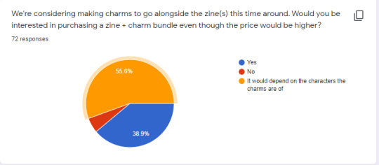
So the only feedback oriented question from the General Section was the one about charms! It was a pretty close split, but 56% of people voted to say it would depend on the designs/characters the charms were of.
What we’ve decided to do, in this case, is to have a poll in future about possible charm designs so people can vote on which ones they’d be interested in buying. The designs will most likely be the same chibis that are inside the zine (in the case of Prismatic) or exclusive designs that match the cover (in the case of the AU zine).
As far as other merch, we’ll also be having die-cut vinyl stickers and sticker sheets. As well as the A5 prints of course.
The Content Section


(individual comments obscured for confidentiality)
As far as content, most people were fine with the allocated amount of pages per AU, so we’ll stick with the same amount we proposed in the concept pitch.
For the theme, “Just Fantasy” was the most popular, followed by High Fantasy in second place. In light of that, we won’t have a specific branch of fantasy pinned for applications, and just have them open for all types of fantasy AUs.
However, if the AUs that are chosen all fall under one of those categories anyway, then we’ll probably re-brand the zine to that specific theme.
The Applications Section


(individual comments obscured for confidentiality)
Concerning the new allowances & limitations put on general applications, over 80% of people voted in favor of them, so we’ll keep them as they were pitched.
I did want to quickly address the limitations put on the writer applications, because it was pointed out that it seemed a little unfair to further limit the amount of work writers can show when we’re also raising the allowance for artists.
The reason we’ve decided to implement a word limit for writers, is due to active versus passive attention and focus. It takes more time and mental focus to consume written content than artistic content at an appropriate level for application review, which means that it’s not only easier for the writing admins to review applications when the word count is lower, but they can also recognize and appreciate more of the craftsmanship put into the writing.
Having more material (whether it’s art samples or word count) does not necessarily mean better content or better chances of being successful. We raised the allowance for artists because it was pointed out in feedback that 5 samples wasn’t really enough to get a sense of some artist’s skills (especially those who had rather inconsistent styles), and our artist admins agreed with that. With writing, 5000 words is more than enough to get a sense of a writer’s strengths and weaknesses; applicants shouldn’t be worried unless they truly don’t know what their strengths are.
Secondly, word count limits on writing applications are fairly common practice for zine applications, not to mention they’re almost always used real-world, not-fandom-based circumstances when it comes to writing submissions. (For example, writing competitions)
I do want to clarify (because it seems that this was lost in translation) that only one of your samples has to be a completed, stand alone piece of approximately 1000 words or less. The rest of your samples can be extracts for longer pieces.
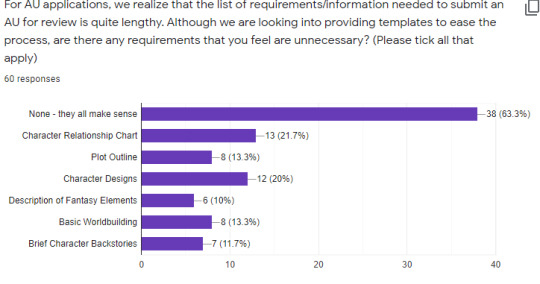
As far as the requirements to submit an AU, and while we still agree that all of those elements are important to building an AU, only Plot Outline, Description of Fantasy Elements, Character Backstories, and Character Designs will be required for applications. Basic Worldbuilding and Character Relationship Chart will be optional, but, in the event that your AU is chosen for the zine, you will need to complete both before the creation period begins in March 2020.
Also, for Character Designs specifically, we will allow people to submit detailed descriptions in place of sketches/drawings, if they wish, for the purpose of applications. However, once again, if your AU is chosen, you will have to complete colored sketches of the designs before the creation period begins in March.
The idea behind the AU zine is that contributors will be split into groups of three for each AU (one writer and two page artists), where the AU creator is the group leader and the one with the most creative control of what goes into the writing and art, given that it’s their AU. As such, the AU creator needs to have all the necessary information in place before the creation period in March begins, so that all three of you can immediately begin discussing what to draw and write, and so that the other two contributors aren’t forced to help the creator flesh out their AU, when that’s something the creator needs to have done themselves already.
Finally, just a quick clarification: the information requirement templates are not the final pages for the zine. The information is needed for the admins to review the AU and for the other two contributors in the group to be able to work from.
(individual responses obscured for confidentiality)
As mentioned in the beginning of this post, in response to the result of this question being a pretty close split, we’ve decided to allow co-creators to apply on a case-by-case basis.
If co-creators would like to apply, the process would depend on if both creators are applying and if both creators are okay with only one getting to into the zine, and, if so, which creator that would be. This will most likely be a separate form, if both are applying together.
The Possible Schedules Section

(individual responses obscured for confidentiality)
Also mentioned in the beginning of this post, 71% of people voted for schedule #2, so that means we’ll be running both zines, but they’ll be released and up for pre-order at different times.
This means that Prismatic will be released first in July, followed by the AU zine later in the year. The rough schedule is outlined in the concept pitch post.
And that’s a wrap! We did also take individual responses into consideration, however we’re not showcasing those responses to keep the confidentiality of the form!
13 notes
·
View notes
Text
My thoughts on the new show
It’s not really a proper review because how would I even do that, so here are my various thoughts, somewhat collected! (This is long as hell, fair warning.)
General thoughts:
Le Chevre and El Topo are definitely a couple. I’m so glad other people in the tag are seeing this too. My first inkling was when they were hugging each other after graduating, but it was Carmen’s comment that they only ever work together that really got me like “oh they’re gay.”
Speaking of gays, Dash Haber (Countess Cleo’s courier) is one. His voice is so gay-coded, I knew this one immediately. Not crazy about him being an antagonist (even among antagonists), but he amused me, so he’s good.
Even if they have the same names, these are different characters. The exceptions here being Carmen, the Chief, and possibly Julia. This isn’t a Tomb Raider: Legend case of putting characters in different situations and slightly changing their personalities, or even a Tomb Raider 2013 case of radically changing their personalities to coincide with their new paradigms. Chase, Zack, Ivy, and the rest are really entirely new characters that simply share their names with past characters. It’s almost as if the names are references to the past shows and games than ties to those characters.
For the most part, they even have different designs. Zack is certainly the most radical change, but even the most similar have some changes. Prof. Maelstrom isn’t nearly as stocky as his namesake, and while Dr. Saira Bellum has wild hair like Dr. Sara Bellum, it’s a strange shape as well as a strange color, and her skin is darker.
This isn’t the first time something like this has happened in the franchise, either. Minnie Series from Where on Earth is apparently a totally different character from Minnie Series from the original Where in Time game. Adventures in Math changed a lot of the characters’ designs and backstories: some, like Jacqueline Hyde, still had the same core, but others, like Jane Reaction, are so different they have to be considered different characters. And then there are all the different iterations of the Chief: old white guy, middle-aged white guy, middle-aged Black gal, hologram, presumably white guy shrouded in mystery...
I will say that as a result of this, I was disappointed with Zack and Ivy. Not because this Zack and Ivy are bad characters, but because Where on Earth Zack and Ivy are my favorite characters in the franchise after Carmen, and I was looking forward to getting to see them, or at least characters resembling them, again. But, it is what it is.
I get the Kim Possible comparisons, but they’re not where I’d jump first. There are similarities: both are action shows with deliciously OTT villains (though the VILE gang wish they were as effortlessly iconic as Drakken, Shego, and Señor Senior, Sr. and Jr.) and similar art styles, and Player/Wade is a fair comparison. But I have to say I’d never have thought of that comparison if I hadn’t seen it here on Tumblr, perhaps because KP was rooted in Kim and Ron’s daily lives (Sailor Moon-style), whereas CS is rooted in its overarching plot (Chuck-style).
I do agree with another comparison: Coach Brunt and Countess Cleo, and Eartha Brute and the Contessa. I saw a post in the tag earlier today that brought this up, and while I hadn’t thought of it - probably because the Where in the World show is one of the parts of canon I’m least familiar with - it seems legit to me. I had wondered why these two were seemingly born out of nowhere, when the other three had their names and likenesses drawn from Where on Earth characters. (Shadowsan seems to me to be based on Suhara’s design and, to some extent, personality, with Shadow Hawkins’ name.) The specific theory that post espouses, that it’s a legal issue, seems possible to me. Although the World villains did appear in other Carmen media, I know WGBH and WQED own the copyright to the show, though they licensed the franchise from Brøderbund. So I have no idea what the legal tangle is behind that show, and I imagine it’s very complicated.
Speaking of WGBH: I wonder if Zack and Ivy being from Boston is an incredibly subtle reference to its location there.
I have mixed feelings about the art style. It is great in still shots, but I found it a little hard to watch as animation for very long.
I don’t ship anything – yet. Julia’s clarification of “travel partner” is certainly ripe for shippy implications, but for me there’s really not much on a personality level to ship her and Carmen at this point. (Likewise Carmen and Ivy, or Carmen and Zack.) I could definitely get behind Julia having a crush on Carmen, the way I feel OG!Jules certainly does.
As to Gray... he was plainly asking Carmen out / hitting on her when he gave her his card. But even on the way to the date, she insisted she saw him as an older brother figure. Like with Julia, I could potentially get behind it in future, but I’d have to see it developed further. There’s also the matter of him trying to kill Carmen, which I’m not crazy about... Carmen’s forgiven him since he was under orders from VILE, and his mind-erase courtesy of Dr. Bellum has given him a fresh start, but it didn’t change who he fundamentally is as a person, and that person made the decision to join VILE and ultimately to agree to kill Carmen. But I’m not totally anti-Carmen/Gray at this point.
(In re Carmen’s sexuality: I have always felt strongly that all of Carmen’s previous incarnations were ace/aro, but this Carmen? The sapphics have claimed her, and I’m here for it. I’m fine with her being gay, bi, or pan. I’m fine with her being acespec and/or arospec, or not.)
I was surprised by the violence. Scenes of literal attempted murder would never have made it in previous shows or games! In fact, a lot of the melee combat wouldn’t have. The franchise hasn’t always been totally non-violent - Ivy whacked the occasional villain around on Earth, and ThinkQuick and Stolen Drums both required the player to destroy VILE robots, the former featuring robots with personalities - but I don’t think it’s ever been shown in such detail as the combat scenes in this series. I don’t have a problem with it, exactly, but it was a little jarring.
Things I didn’t like:
The educational moments were utterly didactic. I guess you could say the same about Earth, but I feel like it integrated the education into the plot better, and it certainly made the educational moments more fun by working jokes into them. Meanwhile, this show is taking the Stolen Drums approach of info-dumping for two minutes and then moving ahead with the actual plot with no attention to education thereafter. To go back to my favorite video game (I warned y’all), fucking Tomb Raider: Legend did a better job integrating education with action. And it’s not even supposed to be educational!
Stop trying to make “caper” happen. It’s not going to happen. It’s a perfectly good word to use from time to time, as it always has been in canon, but for “The ____ Caper” to be every episode title, and for it to be used at every opportunity in the script when “theft” or “heist” or another word could have been used just as easily gets annoying. The thesaurus: it exists. Also, it’s so overused that at a certain point I started thinking of the culinary garnish instead of a crime. (And I’ve never even eaten capers. I don’t think I’ve ever even seen them in person.)
I’m not crazy about the newly established genesis of Carmen’s name. Having her grow up with no name but “Black Sheep” makes me feel uncomfortable tbh, and while I like the significance of her choosing her own name, pulling it off a hat label seems cheap. And out of character for someone as thoughtful as Carmen.
Some of the villains seemed like real cultural stereotypes. Thankfully, it was not nearly as bad as Adventures in Math, or we’d literally have had Le Chevre saying, “Hon hon hon, baguettes!” but Shadowsan and Paper Star in particular made me uncomfortable as they felt like very stereotypical “Japanese” characters. The same could be said of Coach Brunt, who while not a stereotype of any marginalized group, was definitely a bit one-note. Coach Beiste, but evil and Texan.
Cross-language misspellings. Namely, Shadowsan and Le Chevre should be Shadow-san and Le Chèvre, should they not? The omission of accent marks has always been one of my major bugaboos, and while it’s not the first time the franchise has done it, it still annoys me. Shadow-san’s missing hyphen annoys me even more, since the hyphen indicates that other honorifics could be used, and in fact, it would (if I understand correctly) be more appropriate for his students to address him as Shadow-sama or Shadow-sensei while his peers call him Shadow-san.
I felt some real misogynistic undertones to Tigress. In a show that otherwise is quite female-forward, it irked me that of Carmen’s four classmates, only one is a girl - and she’s the one who becomes Carmen’s rival. And then for that to continue throughout the series, setting her up as the mean girl to Carmen’s good girl (in many ways, the Regina to Carmen’s Janis Ian), really bothered me. I certainly don’t think female characters have to be perfect, or expect perfect representation, but it feels like Tigress’ development just was not done mindfully, and instead they let themselves fall into misogynistic tropes. It’s not like you to pit women against each other, etc. etc.
The ages and timeline confused me. Carmen seems to be in her late teens or early twenties throughout the main part of the series (I saw a post that mentioned she says she’s 20), yet she was clearly still a preteen or young teen when she stole Cookie’s hard drive. Since Cookie’s delivery is an annual event, its information shouldn’t last Carmen those several years to grow up.
By a similar token, Player seems to be the same age in the flashbacks as in the present day. As a result, he seems a little older than Carmen to start, and a few years younger to conclude. It messes me up. Not least because, not gonna lie, I want to be sure it’s okay for me to be so gay for Carmen.
Things I liked:
The references to previous canon. Along with the aforementioned names, we have:
Rita Moreno’s cameo! (Please, please, God, give us another Rita cameo and cameos for the rest of the Earth cast next season.)
Mentions of punning names. This was delightfully lampshaded with Gray’s original codename of “Graham Crackle” and the subsequent drags from his classmates. And while most of the other characters didn’t get punning names, one of the two who did was Rita’s character, Cookie Booker, the bookkeeper - or, indeed, book-cooker.
The very meta plot point of Carmen getting her outfit by stealing it from Cookie, voiced by her previous incarnation’s voice actor.
Frequent utterances of “Where in the world is...” or “Where on Earth is...”
Tigress’ name, a reference to an Earth episode where Carmen faces a new rival. I don’t know if the Duchess plotline was also a deliberate reference to this episode, or a subconscious one, but it’s so similar that I can’t think it was total coincidence.
I’m thinking “the cleaners” are a reference to the Ick brothers, the janitors from World and USA 3.0.
Carmen is ginger. I have a significant bias for redheads. (I dye my hair red and am only half-joking when I call myself transginger as well as transgender. Heaven on Earth-era Belinda Carlisle is one of my major style rolemodels.) Carmen suddenly being auburn for the first time just makes her even more endearing to me than one would have thought possible. Plus, Ivy and Zack both being redheads? Iconic.
Carmen is also gorgeous. Now, unlike some of you, I have never previously been gay for Carmen; she’s always been more of a big sister figure to me. Instead, as a kid, I was gay for TV!Jacqueline Hyde, Ann Tikwittee, and Ivy, in that chronological order. But the moment I saw this Carmen with her hair up in the trailer, I was a goner. And in her cocktail dress at the charity auction, or her black catsuit at the end of episode 9? I thirst. There were several other points as well where I was just like, “Oh my god, she’s so pretty.” Yes, darlings, I am very gay.
That choker. Most fashionable thing Carmen’s ever worn. Fight me. We love a stylish queen.
Player has a fidget spinner. And it’s only seen briefly, which to me says it’s an everyday part of his life, not something they threw in to try to seem cool... Which in turn allows me to point to something and headcanon that Player is autistic. He’s also known mostly by a username, and spends most of his time working on his special interest, and doesn’t seem to be one for socializing in traditional ways. We love an autistic prince. (Also, this makes him in some ways a male version of my girl Futaba from Persona 5. Again, iconic.)
(To be clear, especially since it wasn’t in my little self-introduction the other day, I’m self-diagnosed on the autism spectrum. So well-written characters being autistic is really fun for me.)
Player is from Niagara Falls, near where I live (I’m on the outer edges of the Buffalo/Niagara Falls MSA), while Zack and Ivy are from Boston, where I’m moving next month. Totally personal to me, but I’m so delighted. Now, granted, Player is on the Ontario side of the Falls rather than the New York side, but still. (Hell, who can blame him for not living in Niagara Falls, NY? It’s a hellhole.)
The VILE leaders stay iconic. Countess Cleo’s crush on Zack in his “Duke” guise is hilarious and adorable, and Dr. Bellum’s obsession with cat videos? Legends only.
Paper Star is generally fantastic. It’s actually too bad for me she’s a villain, because I find her super likeable. Her tendency to hum/sing to herself is also really endearing, and she’s another one who’s easy to headcanon as neurodivergent. I really hope we get more of her, and more of her outside combat and the daily business of villainery, because she’s easily my favorite of the VILE crew.
Tigress is also awesome. Yeah, the female character bias is real, but she’s def my second-favorite, which amplifies my annoyance at the aforementioned misogyny. To be honest, though, part of it may be that she’s basically Amanda Evert, my girlfriend from - you guessed it, folks! - Tomb Raider: Legend, with purple lipstick.
Zack and Ivy met Carmen while casing a donut shop. This is so delightfully silly, and I adore it. Like, who the fuck robs a donut shop of all things? I feel like it could’ve been a reference to them being fat, maybe one that was meant to be developed further but ended up on the cutting room floor? On that note...
The fat positivity is real. Zack and Ivy are still able to move around and are even somewhat athletic; the Countess crushes on Zack; and nothing negative is said about their weight (except the potential implications of the donut shop). I love this.
Carmen and Jules’ conversation. As I said above, it’s not enough for me to start shipping them, but I love that Carmen casually addresses her as Jules rather than Julia. It’s so much like when people I don’t know well call me Soph instead of Sophie, which I always love because it connotes that closeness. Moreover, since Julia’s previous incarnation / namesake was almost always called Jules, and was Carmen’s former detective partner, I feel like there’s an implication that Carmen coined that nickname and it became her primary moniker. It’s just so good, and shipping or no shipping, I really hope we get more interactions between them next season.
The voices are good... mostly. Maelstrom is definitely the one I was most impressed with, as his voice has a lot of character while still being easy to understand. Liam O’Brien was doing a great Tim Curry impression there, but much less egregiously campy and therefore more believable. Sharon Muthu was also fantastic as Dr. Bellum - not as fantastic as WOEICS!Sara’s voice actor (Candi Milo?), but then, who could be? And Kari Wahlgren’s performance as Tigress was snarly perfection.
Gina Rodriguez is a big departure from Carmen’s typically low-pitched voice, but she’s perfectly fine. I never sat up and went, “Wow, what a performance!” but I can’t find any fault with it either. Finn Wolfhard as Player is obviously cross-promotional stunt casting, but surprisingly, it’s also perfect casting.
On the minus side... Zack and Ivy. Part of it is that their accents are so ridiculous that it’s distracting (see above Tim Curry comment). Part of it is that, at least to my ears, the accents aren’t believable - I thought they were supposed to be from Brooklyn until they mentioned Boston. I actually don’t fault the VAs for this, as they both have moments where I got the sense they’d be capable VAs for the characters (and I know Abby Trott is talented as I loved her in Tales of Berseria and Nier: Automata), but rather the voice director(s) who pushed them toward those performances. I feel like if the direction had been different, I’d have liked Zack and Ivy a lot more.
That plot twist. I truly never saw it coming. I suspected that Coach Brunt was not, in fact, the one who found Carmen, but I’d actually thought it might have been Prof. Maelstrom. The extent of Shadowsan’s revelations was a big surprise to me. Kudos to the writers for pulling that off.
Conclusion:
It’s not the series I expected. It’s not the series I hoped for. But it is one that I enjoyed, both on its own merits and for revitalizing the franchise. As I said last night, it is a hell of a feeling to have new Carmen content in 2019 (that’s actually getting attention), and for it to be really good content is a relief.
If anyone else wants to share their thoughts, either one-on-one or with the rest of the community (as it were), please do! I’d love to talk more about this series and this franchise and the thieving queen of my heart, Ms. Carmen Sandiego.
25 notes
·
View notes
Text
Okay I’m making this post for two reasons
One: I will now be tagging all Voltron Season 8 Spoilers under “#Voltron Season 8” so if y’all want to avoid that shit from me, including all reblogs and rants and shit (WHICH IM ABOUT TO GO ON ONE) please blacklist or ignore those posts! I will stop tagging on December 21 (and that’s a while away, but it’s one week after the actual season airs)
Now rant time (please skip if you wanna remain oblivious but this has to do with the supposed “leak”)
-
Okay, so now that I’ve officially dealt with that, I want to talk about this little “leak” situation. I will not be posting the picture because of the reason that this post is alerting to avoid spoilers and some people may want to avoid it and pictures take up a good chunk of posts so... yeah. (Also I know I could do two posts but it’s 1:37 am and I’m exhausted but I need to get this out of my system.)
First off, a description: people who’ve seen it know it’s a picture of Shiro and Roy, a character from the 80’s voltron (I believe) getting married and kissing. In the background there’s Coran, Pidge, lance, hunk- yadda yadda. That is not where I take issue. I actually support this photo (thought I’m incredibly doubtful of it being real- for all intensive purposes we’ll first act as it is and then I’ll go about how it might be fake bs real)
Let me explain:
LGBT Rep- albeit it would not be the rep we were expecting, but keep in mind there’s 13 episodes this season. We do not know if there’s a previous relationship, and for fucks sake y’all adam was a minor character that died. As much as I could hope that he might come back, it would be toxic to both shiro and Adam to rekindle that relationship. They couldn’t come to a compromise in their relationship so they split to do what they felt best for the both of them. For Shiro he wanted to spend his last few years living out his dream and Adam wanted shiro to stay on earth, and they just didn’t work out. It would’ve been incredibly bad for Adam to hang onto shiro and when he got back have to spend next to him at bedside as he died (which the show implied was basically,,, what was gonna happen) and Shiro knew how he wanted to spend his final days and wasn’t given reciprocated support. It was healthy for them to split. If Shiro finds something special in Roy, and they work together and Voltron executes it healthy, then for all intensive purposes y’all,,,, who cares as long as he’s h a p py and we’re getting healthy rep!!! For all we fucking know Roy might’ve been planned endgame for shiro from the beginning- may we recall that shiro and Adam weren’t even supposed to be lovers in the beginning.
A w e d d I n g- okay so this could fall under 1, but think about it. Not only would we be getting rep, but we’d be getting a canon wedding. We’d be getting two characters- two mlm characters who come together and get married and get a happily ever after.
Shiro moves on & finds new happiness- I briefly touched on this in one, but mostly about the Adashi thing. Shiro and Adam broke up before Kerberos, and while I’m sure that shiro had a few words to say to him- sorry’s and whatnot- Adam died as well. He has to move on. And for those of y’all that might claim it’s too soon- yeah shiro might grieve but he’s spent years in space with time to deal with his emotions after the breakup. There would be no rebound situation happening, and for shiro to be able to move on with someone who completes him and makes him happy is actually amazing writing! It’s like his arm in a way- he had a Galra arm and he got rid of it and now he has a new one and it’s healthier for him because it doesn’t hurt him, it doesn’t link to his past- he’s able to move on. That’s a good thing to do, and he’s had ample time...
Now my arguments about fake vs not
I’m gonna start right up with all the reasons it’s probably fake
All that text??? In front of it??? The yellow and grey shit? I don’t know about you, but that doesn’t seem very in place (for reference it says “do not copy” and “nbcu” repeating) - with the matt leak we got of the same exact quality, there was no text
“Property Of dreamworks animation Do not duplicate” - what the fuck,,, like why is that there?? Especially on a “leak” (which is the quality we get, so it’s not a Still voltron gives us as like here’s what to look forward too! And for clarification, I can justify maybe it’s there as like a showcase thing someone got ahold of, but even in a showcase they wouldn’t put that stuff there because it’s all people working on the process of the show why put that over)
Gonna be real here it’s mostly those two that seem really suspicious for working on a show...... but all the points it might very well be real
The art style is the same. Here’s the thing- people in this fandom are skill- and I mean fucking skilled- at making edits. But for a fake leak to go through all the work of making outfits (and multiple frames but we’ll get there) is... a lot, I’m going to be real. It doesn’t seem like something a fan would do just to fuck with everyone (but I’m not going to entirely doubt it I know better than that)
Multiple frames- If you look between the three stills, the time moves up and accurately. The first two are 01:22:42:02 to 01:22:43:18 and the third is 01:22:45:02, moving from holding hands to kissing and Voltron moves pretty fast so... assuming that’s hour minute second millisecond it’s actually about right (and as a bonus, the characters in the background move too- specifically hunk I notice, plus the zoom in and this like piece of confetti that moves and the background)
Noticeable characters- so if it wasn’t enough (and yeah I’m still asstroubled about that matt dies theory but I’ll save that for another day) chip is there. Pidge’s glasses and all while Pidge is sans glasses. Characters look noticably older, like post hospital (and what’s that thing to do with the sleeping I fucking sweAR)
Similar in design to the matt leaks, the timers (as previously mentioned) are in the same spot, and the frames are of the same quality as the matt leak was so hmm??
A point I’m not entirely sure what to do with:
It’s not colored- which I mean could just mean it’s still in production or it’s been filtered. I’m not sure
Look guys, real or not, don’t go getting pissed off and attacking the crew or other people no matter your opinion because of this - we don’t know if it’s real or not and we don’t need to start a feud because of this- just,,,, be kind.
(P.S. feel free to send me an ask or dm me if you want the stills I have them saved)
5 notes
·
View notes
Text
Email Transcript with Nick Cross
The following is a transcript of my email correspondence between myself and Nick Cross, head art director for the Cartoon Network short development program done as research for my video Into the Unknown: A Critical Analysis of Over The Garden Wall. Unfortunately, the initial Tumblr ask that spurred this interview has been lost to time, but I hope you enjoy this transcript.
Best Wishes.
Monday 9/26, 1:09 PM
Hi Henry
I'd be happy to help you out in any way I can
Nick
Tuesday 9/27, 11:43 PM
Hello Mr. Cross,
Thank you very much for contacting me. I'm sure it is very clear that I am big fan of Over the Garden Wall, so I can't tell you enough how much I appreciate you answering some of my questions. I should point out that I will need to provide a transcript of your responses for my professor, so I will be saving all of these email correspondences.
With that, here are my questions:
One of the key aspects I wish to highlight in my project are the various factors that influenced the creation of Over the Garden Wall. The first influence I would like to ask about is in the show's art direction. Many critics have noted that the art direction of the show very much mirrors grisaille paintings and the works of Gustave Doré; what was it about these art styles that you found inspiring? Are there any other art forms that influenced the show's art direction?
My second question relates to design. What were some of the directions you were given when designing and creating the backgrounds and the characters? I'm particularly interested in how each chapter seems to reflect a different time period in both costumes and architecture. Was this a conscious design choice from the start? How did you choose which time periods to evoke? Did you have to research anything for the shows art direction?
Thirdly, I am curious about the influences on the show’s writing. The story contains themes and characters evocative of gothic literature as well as the traditional “hero’s journey” tale. From where was the inspiration for the writing style drawn? What other factors influenced the writing?
This show seems to have been inspired by early cartoons as well. I know that the episode “Chapter 8: Babes in the Woods” was inspired by the early Disney cartoon "Alice's Wonderland," though I am curious to know what other classical cartoons influenced the show and why. I am also particularly curious about the “Highwayman” musical number. The uniquely fluid animation style seems reminiscent of an early Fleischer Studios Rotoscope cartoon. What made you want to storyboard this scene this way?
Finally, something I have noticed about cartoons in recent years is that the creators are often influenced by the shows that they grew up watching. What were some shows from your childhood that particularly influenced your career in animation, and specifically the creation of “Over the Garden Wall”?
I greatly anticipate your responses, and I may need to ask some follow-up questions in the future if your schedule permits. Thank you once again for helping me with my project, I will be sure to let you know when I finish. If you know anyone else on the show's crew that would be interested in answering some questions, I would be really appreciate it. Thanks again for your time!
Best Wishes,
Henry Kathman
Monday 10/3, 10:03 AM
Hey Henry
Sorry this took so long, I was a bit busy last week.
Here's my answers, let me know if you have any follow ups or need clarification on anything
Thanks!
Nick
One of the key aspects I wish to highlight in my project are the various factors that influenced the creation of Over the Garden Wall. The first influence I would like to ask about is in the show's art direction. Many critics have noted that the art direction of the show very much mirrors grisaille paintings and the works of Gustave Doré; what was it about these art styles that you found inspiring? Are there any other art forms that influenced the show's art direction?
When Pat approached me to work on the pilot, he sent along a huge folder of artwork for inspiration. Along with Gustave Dore, these included the work of Childe Harold, Edward Lear, Harrison Cady, Ivan Shishkin. We also used old chromolithographs for inspiration on the look of the show. So all of this mixed together along with the styles and techniques of myself and all the artists that contributed to the show made it what it became.
My second question relates to design. What were some of the directions you were given when designing and creating the backgrounds and the characters? I'm particularly interested in how each chapter seems to reflect a different time period in both costumes and architecture. Was this a conscious design choice from the start? How did you choose which time periods to evoke? Did you have to research anything for the shows art direction?
Pat wanted it to basically take place in a colonial america style setting. Which meant we had to do a lot of research on the look of everything from that time period. Right down to what door latches look like. One of the board artists pointed out early on that door knobs are a relatively new thing and in the 1700's they didn't exist so we had to research what those looked like. If you watch the show, you'll see all the doors have different handles and latches that are all historically correct...For the episode with the mansion, we had to make sure the architecture of the two halves looked different. For Endicott we made him have a Georgian style mansion - we based the interior on Jefferson's Monticello estate mainly, and for Marguerite - we based hers on the Palace of Versailles which is much more decorative.
Thirdly, I am curious about the influences on the show’s writing. The story contains themes and characters evocative of gothic literature as well as the traditional “hero’s journey” tale. From where was the inspiration for the writing style drawn? What other factors influenced the writing?
I wasn't really involved in the writing of the show. That was really Pat's main focus. I was involved mostly in the look of the show.
This show seems to have been inspired by early cartoons as well. I know that the episode “Chapter 8: Babes in the Woods” was inspired by the early Disney cartoon "Alice's Wonderland," though I am curious to know what other classical cartoons influenced the show and why. I am also particularly curious about the “Highwayman” musical number. The uniquely fluid animation style seems reminiscent of an early Fleischer Studios Rotoscope cartoon. What made you want to storyboard this scene this way?
There were a ton of cartoons that influenced it. Probably more than I can mention. I am hugely influenced by cartoons from the 1920's and 30's. The work of Ub Iwerks and the Van Bueren studios are amazing. I have this memory that I kept pushing for a weird Fletcher bros. style dance number in the show...that particular episode had a song that Pen Ward wrote with the Highwayman and it fit in there. Pat boarded it and then we talked about having it done in a rotoscope style which would mean the animation would have to have been very particular. This sort of animation is difficult to get an overseas studio to do since it would be a lot of work (ie. animating it on 1's - which means they would have to draw twice as many animation drawings) and so it would be kind of unfair for us to demand they do something like that. So I basically volunteered myself to do it. It was a fun challenge and it sort of lends a weird mood to the scene.
Finally, something I have noticed about cartoons in recent years is that the creators are often influenced by the shows that they grew up watching. What were some shows from your childhood that particularly influenced your career in animation, and specifically the creation of “Over the Garden Wall”?
So I grew up in a time before cable tv...most of the cartoons I watched as a kid were old cartoons from Disney, Warner Bros and Hanna Barbera, as well as public domain cartoons. Since many of those were theatrical shorts, and not necessarily meant strictly for kids, the quality was high as well as very innovative. There were no 'rules' back then and they were still figuring things out, so there is a wild sense of experimentation...so I think it shaped the way I view animation now. I've worked in animation for twenty years at this point, and for most of my career that sense of experimentation has been frowned upon. But when I started at Cartoon Network on OTGW, it was great because Pat was very open to my ideas and the network was very hands-off when it came to the look of the show. It felt like we were making an independent film in a lot of ways and so I loved it and went nuts with the visual aesthetic. That was a huge influence-just being allowed to try something new ha.
Friday 10/7, 5:25pm
Hello Mr. Cross,
Thank you so much for all of your answers, they have been a really big help in writing this script. I just have two small follow up questions left for you if you wouldn't mind answering.
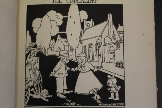
The first is just a bit of specification: When you said that Patrick McHale gave you the works of Childe Harold for inspiration, were you referring to the artwork of the Lord Byron poem collection Childe Harold's Pilgrimage (as painted by Joseph Mallord William Turner) or a separate artist entirely. I'm certain it's the former though I wanted to be sure, just in case.
My second follow up question, many of the artist you showed me were known for creating art based off of classic fairy tales and fairy tale like situations. How important was it to make the show something like a fairy tale, and why?
Those are the only questions I have left for you. Thank you once again for answering my questions and for helping to make such a great show. Have a good weekend.
Best Wishes,
Henry Kathman
Friday 10/7, 6:11pm
Childe Harold is the name of the illustrator, I've attached one of his illustrations.
The show was very much meant to be a modern fairy tale. The art style is meant to seem like something from another time and the fact that the characters are lost children in the woods, witches, ghosts, wolves and woodsmen is on purpose. I think those types of stories really resonate with people especially when you want to make it a slightly scary story for kids.
Thanks again
Nick
11 notes
·
View notes